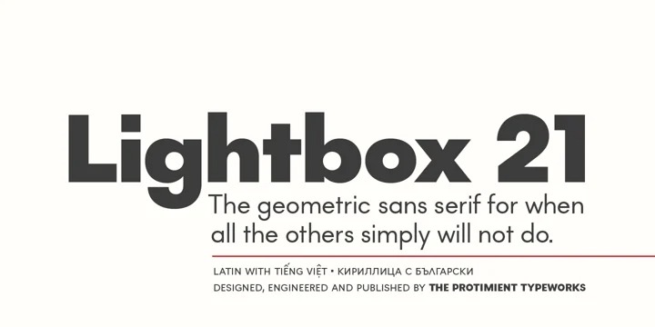
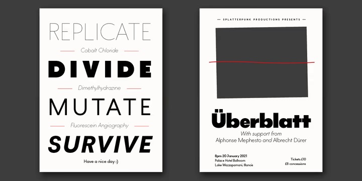
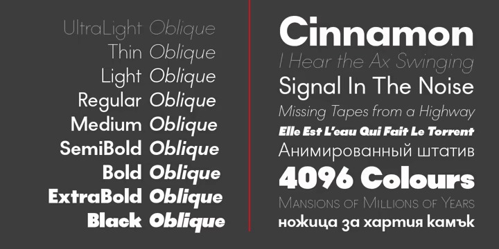
The design of the original Lightbox was fundamentally based on the idea of incorporating the proportions of the ‘Golden Ratio’ into each letterform; Lightbox 21 greatly improves on this concept by entirely abandoning it. The result is a much more readable, ‘natural’ typeface that retains elements of the original without being bound to it.
This font free for personal use, please visit official store for more other products, and buying fonts for support designer. Link to purchase full version and commercial license: HERE.
If you like this font, go click the Download button and you will get this font. Have a good look on our website for other free fonts.


Post a Comment